
Cherry Tooth
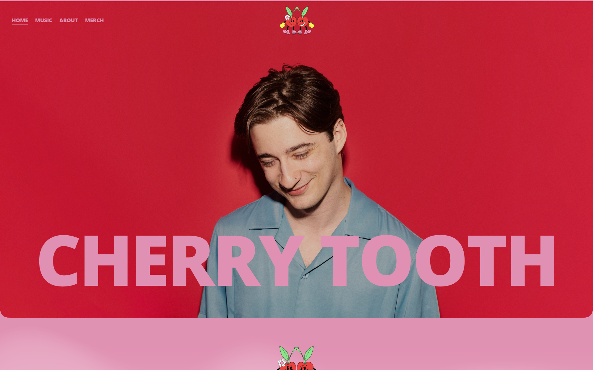
A compact artist-site direction where a vivid portrait and red-pink palette lead into music, artist information, and merch.
- Focus
- Artist Website / Visual Direction
- Tools & disciplines
- Web Design, Artist Website, Creative Direction, Responsive Design
Context
An artist page has to establish a point of view quickly, then get fans to the music and merch without turning into a press-kit maze. The visual identity should do the introduction; the navigation should not make people search for the basics.
Selected views
Select an image to enlarge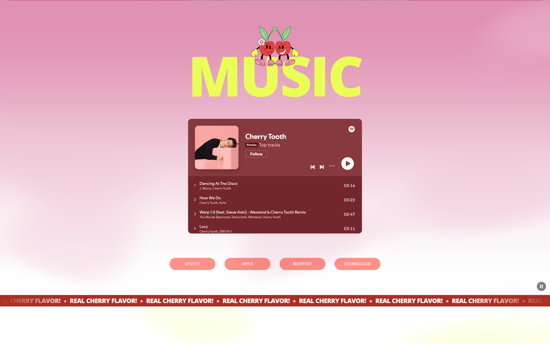
Approach
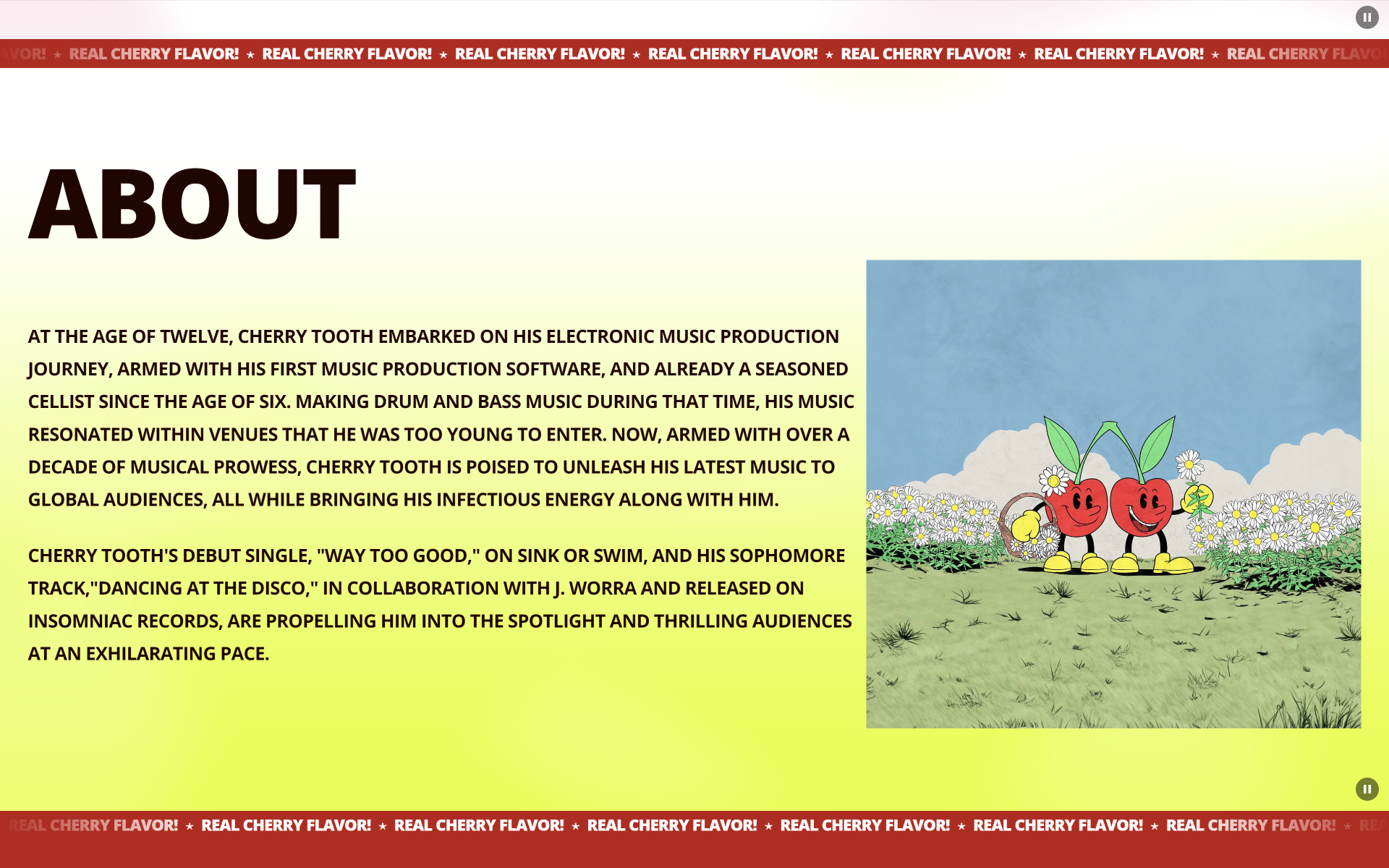
I let one portrait, a saturated red-pink palette, and an oversized wordmark carry the visual weight. The page stays intentionally short: music, about, and merch are clear destinations rather than nested branches. That keeps the artist image in charge while giving fans a direct way through.
Outcome
The result is a focused artist-site direction with a strong first image and a short route to music, artist information, and merch. It is presented here as website and visual-direction work, without claiming a separate commercial outcome.
Project details
- Created a bold artist-site direction around photography, color, and oversized type
- Kept the page structure focused on music, about, merch, and discovery
- Built a red-and-pink visual system around photography and oversized type
- Designed the experience to feel playful without losing clarity
- Supported fan-facing paths with simple navigation and mobile-friendly hierarchy