
Sam Blacky
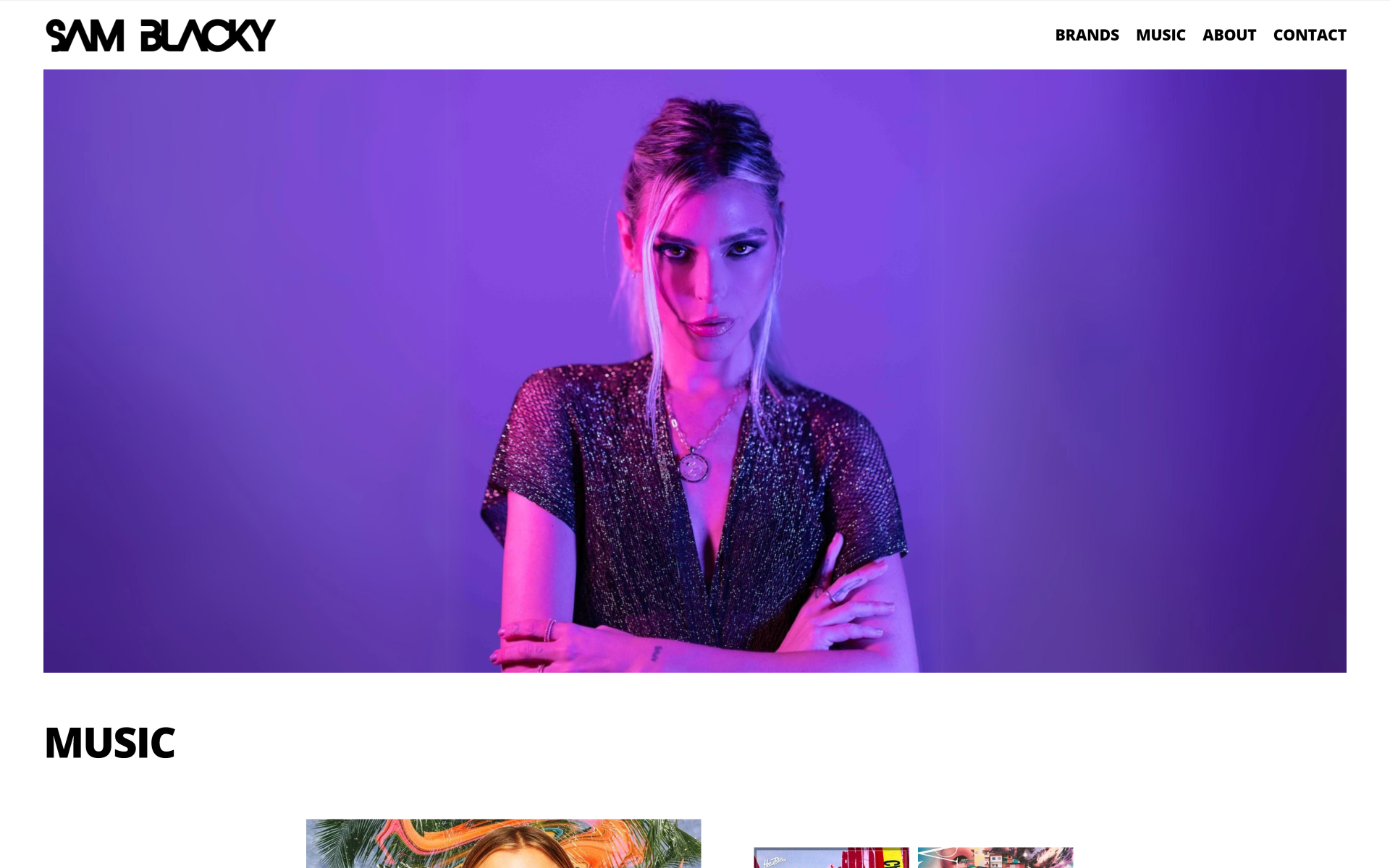
A music-first artist-site direction with bold photography and direct paths to music, brand work, artist story, and contact.
- Focus
- Artist Website / Creative Direction
- Tools & disciplines
- Web Design, Creative Direction, Artist Website, Responsive Design
Context
An artist website has to hold two kinds of attention: fans looking for the music and industry visitors looking for brand or contact information. The page needed a strong visual introduction without making those paths compete with the portrait.
The direction needed to feel like Sam Blacky, not a generic press page, while keeping the next action easy to spot.
Selected views
Select an image to enlarge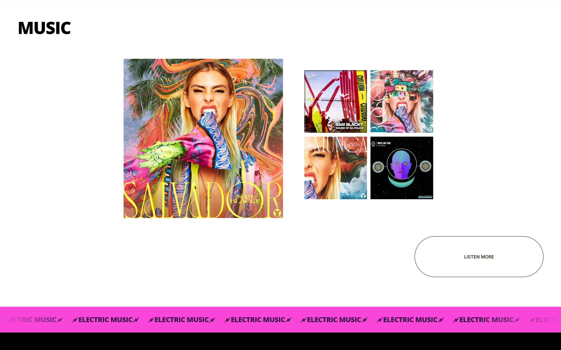
Approach
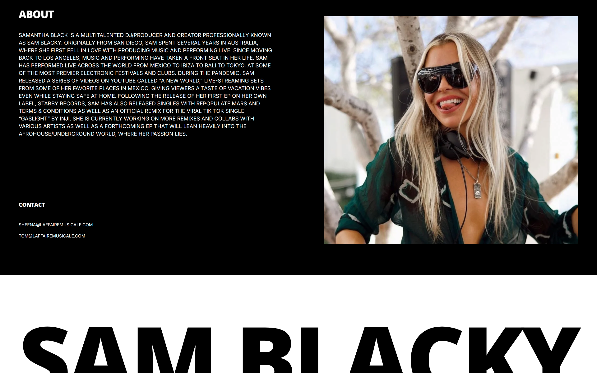
I let one full-bleed portrait carry the first screen, then kept the navigation to four clear paths: Music, Brands, About, and Contact. Violet light and the pink accent make the image feel like part of the artist’s world, while the compact menu keeps practical routes visible.
The visual hierarchy does the work in order: recognize the artist, find the music, then move toward brand or contact details without a long press-page detour.
Outcome
The result is a music-first website direction with a distinct visual opening and direct routes for fans and industry visitors. The artist image sets the tone; music, brand work, and contact stay one step away.
Project details
- Refreshed the website direction for Sam Blacky's artist brand
- Created a bolder visual system around photography, contrast, and music energy
- Reworked the page hierarchy around music, about, brands, and contact
- Gave the site a more direct artist-first presence
- Created a stronger showcase for releases and visual identity
- Clarified contact access for management and booking conversations